Intriguing Visualizations of Data from World Happiness Reports
A data science project, created by Dhruv Syngol, to visualize happiness data from a wide spectrum of countries
Date Created: June 24th, 2021
Curated by: Dhruv Syngol
The World Happiness Report is a publication of data collected by the Gallup World Poll. Data collected consists of a variety of six different statistics, from GDP per capita to freedom to corruption.
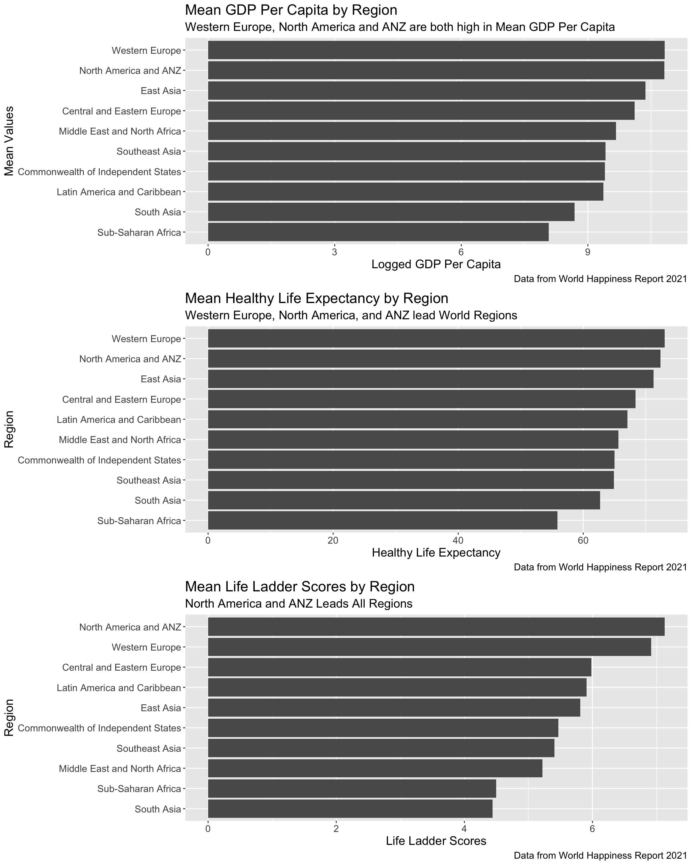
One statistic that the report collects is a Life Ladder Score. The life ladder score is based on the Cantril Ladder Score (on a scale of 10). A higher life ladder score indicates a better life while a lower score indicates a worse life.
Also, the GDP per capitas in the graphs are the natural log of the real GDP per capitas of the countries.
In my first data science project, I wanted to visualize the massive amounts of data collected from the World Happiness Reports over the years in order to present the data in a user-friendly and understandable format. I used the programming language R to achieve my goals.
First, I found two datasets (CSVs) on Kaggle that contained data from the World Happiness Report 2021 as well as data from the World Happiness Report over past years. From that point, I began analyzing, cleaning, and forming creative and eye-catching graphics to illustrate facinating trends in the data.
NOTE: The graphs are best viewed in landscape mode!
For the following graphs, move your cursor on a line in the interactive visualizations to see the year, life ladder score, and country name.
For the following graphs, move your cursor on a point in the interactive visualizations to GDP per capita, life ladder score year, region, and country name.
Double-click on a region in the legend to isolate specific points of that region on the graph. You can click on other regions to compare countries in different regions and their respective scores.
Double-click on the graph if you want to zoom out.
In the first graph, I wanted to create a scatter plot with the life ladder scores and GDP per capita on one graph. I plotted each country and filled each point by region.
The freedom and social support scores signify the extent to which each statistic impacted beneficial changes in life quality. I wanted to plot these scores for each country and fill each point by region.